Visualizing COVID Cases and Tests - Purdue vs. Vermont
As a fun little exercise with my students, we sought to improve the Purdue COVID tracking dashboard. Our quick take was that this display focused too heavily on tests instead of the more relevant positive cases.
After a few iterations, we wanted a design that had the same bits of information, but presented in a way that made them easier to understand. For instance, we ditched the two-axis design with tests and cases mixed and instead scaled the testing volume down to get a ‘positive rate’ line that acts as a means of evaluating the case counts. (After all, that’s what you’d use the test count data for!)
Here’s the design.
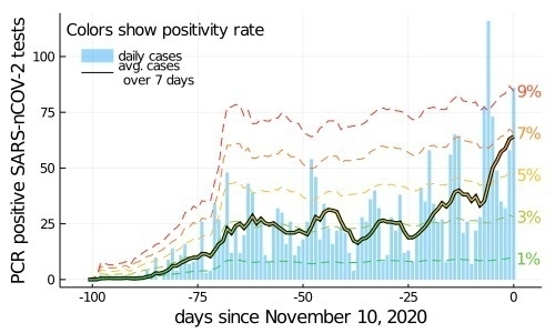
The solid vertical bars are the daily case counts. The thick-black line is the running 7-day average. The internal color of this line gives the positivity rate where 1% is green and 9% is red. The dashed colored lines show the positivity rate given implied by running 7 day count case count. (There are strong day-of-week effects, so the raw data isn’t as meaningful, but 7 day trends are reliable.)
Here, you can see that testing is basically constant through Nov 10 because the constant rate of positivity bars. You can also quickly see that cases are growing recently. (That’s also true everywhere! Maybe we need another plot that compares these to successively larger regions!)
For fun, I tried the same plot for the state of Vermont (I have a relative at UVM!). Vermont has ~623k people. (12x Purdue’s 50k).
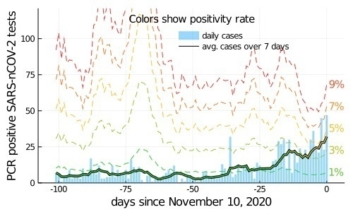
In Vermont, we can see a few testing spikes in the Vermont data, and also the recent uptick in cases. (The last few days are actually quite a bit worse in Vermont, but I wanted the same data region.)
I think the Vermont data shows the visualization isn’t quite as successful in general as we might have hoped because testing there seems less consistent than Purdue.
Caveats
- These were meant to illustrate a visualization (hah, but the title implies a comparison). A good visualization facilities comparison, in which case we might ask more refined questions.
- Critically evaluate the data yourself before drawing any conclusions from these pictures (e.g. maybe I used the wrong field from the covid tracking project data for Vermont!) There may be a typo in my Purdue case counts, which we transcribed by hand.
Here’s the code
## Download vermont
using CSV
data = CSV.read(download("https://covidtracking.com/data/download/vermont-history.csv"))
## align dates
ds = data[6:6+101,:]
##
ds.totalTestsPeopleViralIncrease
##
ds.positiveIncrease

using Plots
gr()
function covidplot(ntests, npositive)
    A = [ntests npositive]
    avgs = []
    ratios = []
    tvol = []
    for i = 1:size(A,1)
        si = max(1,i-6)
        ei = min(size(A,1),i)
        push!(avgs,mean(A[si:ei,2]))
        push!(ratios,sum(A[si:ei,2])/sum(A[si:ei,1]))
        push!(tvol, sum(A[si:ei,1])/length(si:ei))
    end


    cmap = cgrad([:limegreen, :goldenrod1, :firebrick1], [0.2, 0.5, 0.8])
    xx=-size(A,1)+1:0
    Plots.bar(xx,A[:,2],alpha=0.4,
        label="daily cases", linewidth=0, legend=:topleft,
        #fill_z = 100*A[:,2]./A[:,1],
        #color=cmap,
        clims=(1,9),
        legendfontvalign=:top)
    for p in [1,3,5,7,9]
        plot!(xx, (p/100)*tvol,
                linestyle=:dash, line_z=p,
                label="", color=cmap, clims=(1,9))
        annotate!(1, (p/100)*tvol[end], Plots.text("$p%", 10, get(cmap,p/10), :left))
    end
    plot!()
    #plot!(1:size(A,1),avgs, color=:black, linewidth=3.5,
        #label="")
    plot!(xx,avgs, color=:black, linewidth=3.5,
            label="avg. cases over 7 days", legendfontvalign=:top)
    plot!(xx,avgs, line_z = 100*ratios,
        color=cmap, linewidth=1.5,
        label="", clims=(1,9), colorbar=false,
        foreground_color_legend=nothing,
        background_color_legend=nothing,
        legendtitle="Colors show positivity rate",
        legendtitlefontsize=10,
        legendtitlefontvalign=:bottom,
        legendtitlefonthalign=:right, size=(500,300),
        legendfontvalign=:top)
    plot!(xlabel="days since November 10, 2020")
    plot!(ylabel="PCR positive SARS-nCOV-2 tests")
end
covidplot(reverse(ds.totalTestsPeopleViralIncrease),
    reverse(ds.positiveIncrease))
ylims!(0,121)
plot!(legend=:topright)