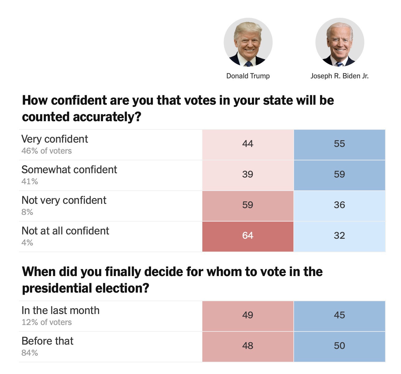
Fixing the NYTimes Horrible Exit Poll page.
I have so many problems with this display of data in the attached screenshot from the nytimes https://www.nytimes.com/interactive/2020/11/03/us/elections/exit-polls-president.html. It’s so easy to misread this in very subtle ways. E.g. this makes it seem like most trump voters don’t trust their counts accurately? But that’s not what the data show at all.
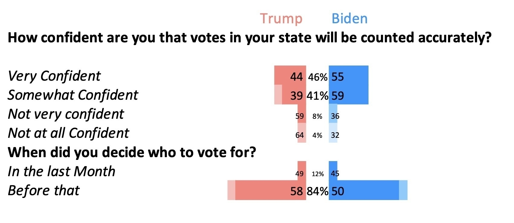
The second one (without the pictures) is an improvement I managed to make in excel. This wouldn’t pass muster (yet) if the PhD students I work with tried to include it in a paper, but it’s close enough and I did it in Excel. Mainly to demonstrate it’s possible. (In retrospect, Inkscape would have been easier…)
This shows almost no difference among the groups of voters! Which is, of course, because we are all Americans and largely trust our voting and make up our minds earlier.